![]()
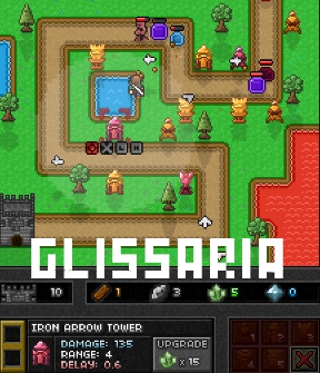
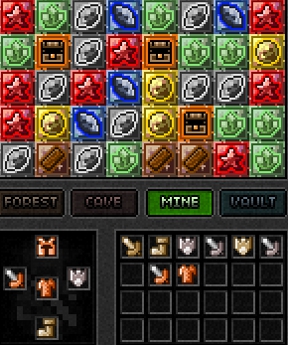
 WARRIORS. Make ready your swords! And your shields! And your defenses! And your resources! And your magical shuffling tile board! And your... oh, just go ahead and pile it all on the pack mule... you're going to need it. Originally made for Ludum Dare, Glissaria by Arkeus is part RPG, part tower defense, and part match-5. You play Prince Trey, a young man sent to the edges of his kingdom to help bolster its defenses against the invading monster army. Swap tiles to gain resources to build and upgrade towers, increase the Prince's abilities, or gain powerful gems and treasure to better see your enemies driven before you. You might also hear the lamentations of your women. I don't know. Do slime beasts have women? Well, something has to lament or it isn't a real fantasy game!
The game can seem a little complicated at first glance. There are two windows; one is where you click and drag tiles around to gain resources (five of a kind), and the other is where you'll keep track of the invasion and build your defenses. Monsters will march along the road towards the castle, and while Prince Trey will move to attack them as they approach, he can't handle everything alone. You'll need to swap wood tiles to gather enough to build, and different minerals to upgrade your towers as you go; as the stage wears on, your available tiles will change depending on what region your gatherers move to. You can also find treasure from chests to equip the Prince, or magical gems from golden tiles that you can slot into towers to give them special abilities. While red tiles heal the Prince when matched, don't worry about him too much; if his health runs out, he just respawns back at the castle. Instead, concentrate on hoarding your resources and improving your defenses. Hit the [spacebar] to pause the game; while you can't swap tiles while paused, you can build or upgrade towers and equip the Prince. Remember; while the prince keeps any equipment he's wearing and all the levels he's gained across all the stages, you can't take your resources or gems with you, so don't be too stingy with them.
 Analysis: To say Glissaria is ambitious is kind of an understatement, since juggling so many different genres is something a lot of developers would balk at. There were a lot of ways this could have gone terribly wrong, so it's more than a little impressive that Arkeus has managed to pull it off as well as he has in such a short development time, with only 48 hours to create the original build. Of course, what you're playing now is already significantly improved, since he's working hard to expand and develop it into a full game... though that's not to say that's what here isn't already a lot of fun. The style and presentation is great, the different towers and gem varieties allow for a surprising bit of customisation and strategy, and once you get the hang of things it's easy to want to get sucked into Endless Mode for long stretches of time.
That's not to say there isn't room for improvement. The tile-shuffling is almost too clunky at first encounter since it takes a lot of sliding around, while the lack of any real penalty for Prince Trey's death makes it difficult to care about healing him unless you want to get rid of all the red cluttering the board. Neither the enemies or the stages feel like they provide enough variety, which may make you wish for more distinct characters, bosses, or even terrain penalties to shake things up. Story mode also feels underdeveloped, since none of the levels really feel any different and not much story actually happens while you play. And while we're talking about it, why does completing a level boot you back to the main menu every time instead of at the very least taking you to the stage select?! You're telling me I have to click on an extra thing in order to get to the next stage? Man, my life is so hard!
This issues shouldn't be taken as nails in Glissaria's coffin, however, especially since Arkeus has shown every indication of continuing to change and tweak it based on community feedback. While there's no doubt that eventually this is going to be one of the internet's great time wasters, what exists now is still more than playable and a lot of fun to boot. With a remarkable amount of work behind (and ahead) of it, snappy addictive gameplay, and a vaguely retro aesthetic that will reel in the dewy-eyed nostalgic gamers (you know how we do), Glissaria is easily worth a look, and definitely one to keep your eye on.


Oh please please only do clicks for everything. Shifting things with the mouse when the rest of the game is clicking is really hard on the fingers. Take a cue from Corpse Craft -- https://jayisgames.com/archives/2008/07/corpse_craft.php
There's no point making cool graphics if your player can't look at them. I can't enjoy the main screen if my attention is divided by the match-screen. The controls for the matching have to be the simplest of the whole game.
Otherwise, wow, really ambitious. This could be good.
I agree that there's just too much happening at once.
I would much rather see there be a set time between waves when you would focus on matching, and then you would then spend those matches during the next wave.
Balanced and scaled, of course.
Well I think they could still keep the four-pane format, but everything has to be cued and controllable within the fewest number of tutorial steps. For instance, I could use a better sound cue when new items are available to me, and it would be nice if they were separated into their categories. Whenever attention should be shifted, there should be a cue and there should be no hunt-and-peck delay after that.
Along with Shudog's comment, I would add SINGLE clicking would be preferrable. Having to double click and then drag is extra time consuming. Otherwise, I like the game a lot, but the double click issue is making it tedious.
dsrtrosy, that sounds like a bug. I didn't have to double click ANYTHING in this game.
Just remember, when the sun comes up, it is time to take a break.
This thing is SERIOUSLY addictive.
Made in 48 hours? That is some mad skillz your got there!
I personally don't mind the franticness much.
I agree wholeheartedly with the comments by Shudog and LWK.
I would also like to see the custom cursor dropped. It slows down mouse movement just slightly for me, and with so many small things to click on (and drag moves that need to be precise, though I hope those go away too), having a delayed cursor is frustrating. Even more so because I'm playing on a track pad.
I hope to see these changes, because I can tell there are great things going on here. But as is, I lost interest before completing even the first level.
Hello there,
congrats for this awfully cute and fun game :)
While the mechanisms of the game worked perfectly for me, I found it to be a tad too easy. I tried only Hard difficulty, and did all the levels in a row. Some kind of Super-Hard difficulty would have been enjoyable :)
PS : 48 H to do this ? 0_o This is awesome !
Interesting so far. I agree with some of the comments that is it really hard to keep an eye on both the resources and the battlefield, so we don't get to witness all the pixel art beauty.
Also, the game straight away reminded me of King's Guard, which I thought was quite fun in a grindy sort of way. I'm loving the new integration of match-3/5 games with rpgs, turn-based battle, etc. Best of both worlds.
All in all, amazing that this was put together in 2 days and then just refined/tweaked.
One more thing: if you need a leg up,
Grind resources, especially chests and experience stars, on the tutorial (first level). Trey's equipment and levels carry over.
There is any way to remove equipment from the inventory?
Update